Shortly after I posted the CSS 3D cube tutorial last week my friend Marlon jumped on the comments and suggested I create a mobile version. I played around with device orientation and JavaScript earlier in the year when me and Marlon were working together at Specialmoves so I presumed this is what he meant and it was a great idea!
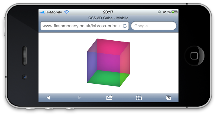
I’ve now had a bit of time to put it together and created both an orientation version using the device accelerometer and also a touch event version (as whenever I showed someone the orientation one they tried to spin the cube with their finger!). Before you attempt to view the links you’ll need to be using either a tablet or mobile device and viewing in a browser that is WebKit powered as with the tutorial (iPhone, iPad and Android phones should be fine). Don’t start touching your computer monitor as nothing will happen (that was mostly for my Dad). ;)
Device accelerometer
First up the orientation version which can be view here. To get a device orientation via JavaScript is as simple as merely listening to an event.
var orientation = 0;

window.addEventListener("orientationChanged", function(event) {
    orientation = event.orientation;
}, true);

window.addEventListener("deviceorientation", function(event) {
    // process event.alpha, event.beta and event.gamma

    var x, y;

    if(orientation == 0)    x = event.beta;
    else                    x = (orientation == 90) ? event.gamma : event.gamma * -1;

    if(orientation == 0)    y = event.gamma;
    else                    y = (orientation == 90) ? event.beta : event.beta * -1;

    $('.cube')[0].style.webkitTransform = "rotateX("+(x * -1)+"deg) rotateY("+(y * -1)+"deg)";
}, true);
The orientationChanged event is dispatched when the window changes from portrait to landscape and visa versa. deviceorientation then gives you the x / y / z orientation of the device.
Touch Events
Next we’ll look at the touch event version which can be viewed here. Again the code is pretty simple as shown below. I’m planning on writing a simple tutorial for touch events so hopefully should have that up soon.
var vx = 0, vy = 0;
var px = 0, py = 0;
var lastx, lasty;

document.addEventListener('touchstart', function(event) {
    event.preventDefault();
    var touch = event.touches[0];
    lastx = touch.pageX;
    lasty = touch.pageY;
}, false);

document.addEventListener('touchmove', function(event) {
    event.preventDefault();
    var touch = event.touches[0];
    var mousex = touch.pageX;
    var mousey = touch.pageY;
    if(lastx !== mousex) vx = mousex - lastx;
    if(lasty !== mousey) vy = mousey - lasty;
    lastx = mousex;
    lasty = mousey;
}, false);

function render() {
    px += vx;
    py += vy;
    vx *= 0.9;
    vy *= 0.9;
    $('.cube')[0].style.webkitTransform = "rotateX("+px+"deg) rotateY("+py+"deg)";
}

setInterval(render, 50);
Finally I put them both together to create this version that utilizes both device orientation and touch events.