In my last post I talked about doing a tutorial for the CSS 3D Clock I recently made. However, instead I think I’ll just go over how to create a simple cube with CSS, and rotate it a bit with JS so we can see it really is 3D. Once you have the basics it’s up to you to go away and do something creative with it.
Before we start I should mention that unless you are viewing this in a browser that is powered by WebKit you won’t see the examples. Currently that mean’s you would have to be using either Safari or Chrome.
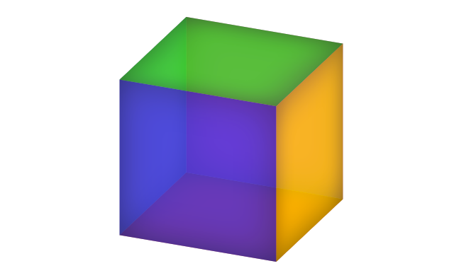
So let’s start by looking at the markup. It’s very simple – a wrapper then 6 divs to represent each face of the cube.
<div class="cube">
    <div class="face one"></div>
    <div class="face two"></div>
    <div class="face three"></div>
    <div class="face four"></div>
    <div class="face five"></div>
    <div class="face six"></div>
</div>
As you can probably imagine, given the name of this post, all the magic happens in the CSS. Let’s take a look starting with the styles applied to the cube’s wrapper.
.cube {
  height: 240px;
  position: relative;
  margin: 0 auto;
  width: 240px;
  -webkit-transform-style: preserve-3d;
}
Most of this is simple stuff you will have seen a million times before. Height and width are self explanatory, position is relative and we’re using the margin to center the cube horizontally. However, something you may not have seen before is ‘preserve-3d’.
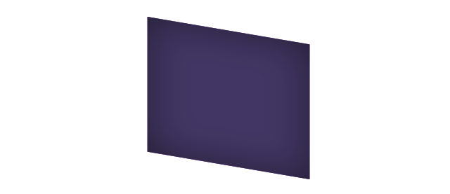
So what is ‘preserve-3d’ and why do we need it? You will require this if you are applying 3D transformations to the children of an already transformed element. Without it the child elements will appear on their own planes and would appear flat in front of their parent, as show below.
Next we need to apply styles to the cube’s faces. The initial .face class is relatively straight forward. Here we just set a height and width (remember them, we’ll need those later), then just add some general aesthetic stuff like some inner shadow and opacity to make the cube look nice.
.face {
  background-color: rgb(50, 50, 50);
  -webkit-box-shadow: inset 0 0 100px rgba(0, 0, 0, 0.5);
  height: 240px;
  opacity: 0.7;
  position: absolute;
  width: 240px;
}
The only important thing here is ensuring positioning is set to absolute. This is so we can rotate the faces and move them about easily to create the cube – which brings us onto the next step.
Finally, the bit where our cube comes together. We have to rotate our faces on certain axis, as beautifully illustrated by me on the right (that’s right I’ve got 3 arms) and move their positions to create a cube. We are using the size (height/width) of the faces to position them. Simple!
.cube .one  {
  background-color: rgb(242, 24, 25);
  -webkit-transform: rotateX(90deg) translateZ(120px);
}

.cube .two {
  background-color: rgb(235, 41, 158);
  -webkit-transform: translateZ(120px);
}

.cube .three {
  background-color: rgb(252, 209, 22);
  -webkit-transform: rotateY(90deg) translateZ(120px);
}

.cube .four {
  background-color: rgb(44, 45, 213);
  -webkit-transform: rotateY(180deg) translateZ(120px);
}

.cube .five {
  background-color: rgb(125, 105, 181);
  -webkit-transform: rotateY(-90deg) translateZ(120px);
}

.cube .six {
  background-color: rgb(22, 226, 38);
  -webkit-transform: rotateX(-90deg) translateZ(120px) rotate(180deg);
}
Now we’ve got our cube let’s chuck in some simple JS to make it rotate in relation to the mouse position. Once again we’re using WebkitTransform rotateX and rotateY but this time we’re applying the style on the fly with JavaScript.
$(window).on('mousemove', function(event) {
    var width = $(window).width();
    var mouseX = event.pageX - (width * 0.5);
    var height = $(window).height();
    var mouseY = event.pageY - (height * 0.5);
    var xAngle = (mouseY / height) * 90;
    var yAngle = (mouseX / width) * 90;

    $('.cube')[0].style.webkitTransform = "rotateX("+xAngle+"deg) rotateY("+yAngle+"deg)";
});
You can see a standalone version of the finished cube here and for further reading take a look at Peter Gasston’s Adventures In The Third Dimension: CSS 3D Transforms article over on Smashing Magazine’s website.